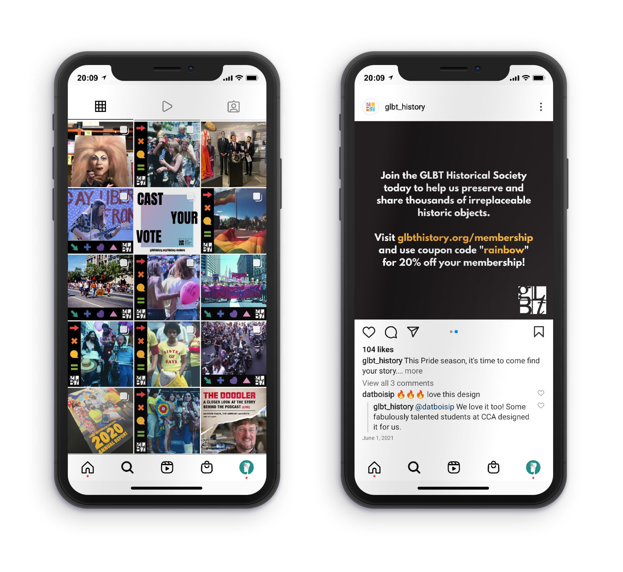
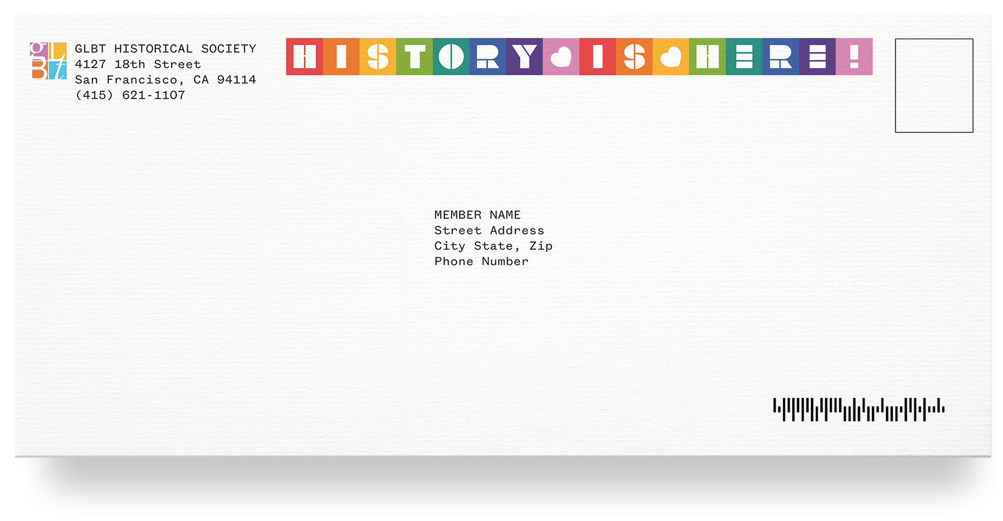
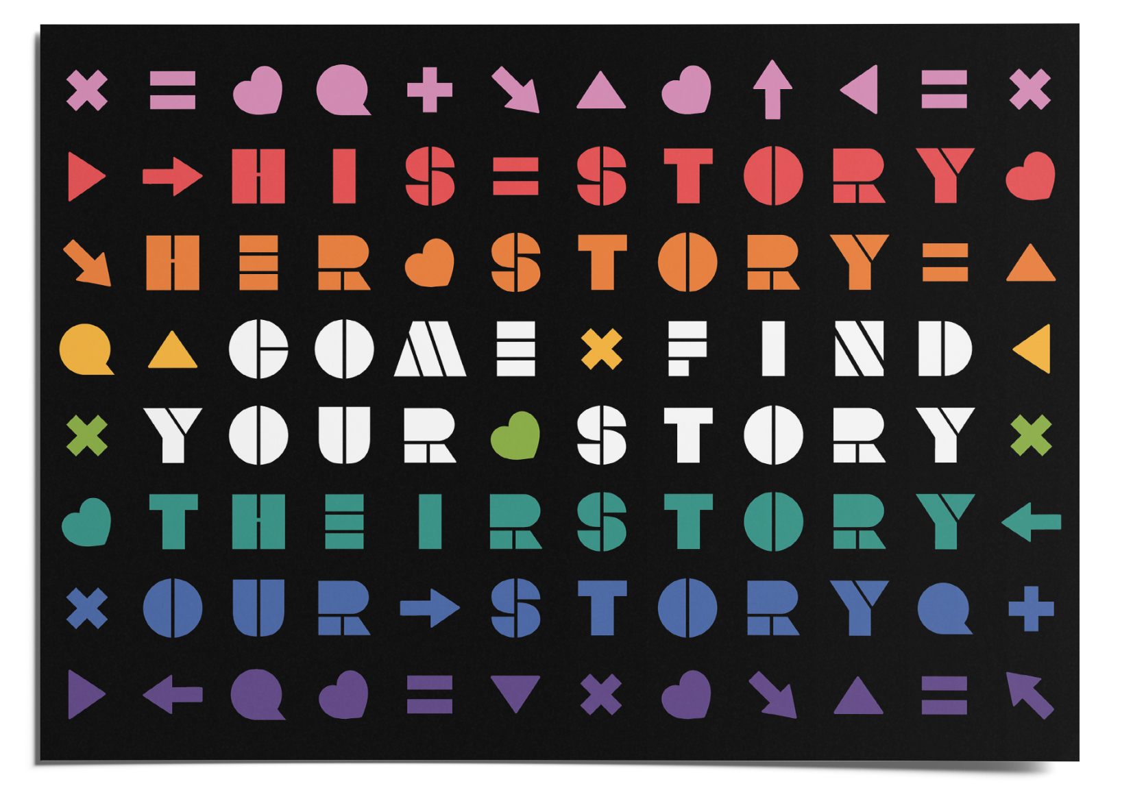
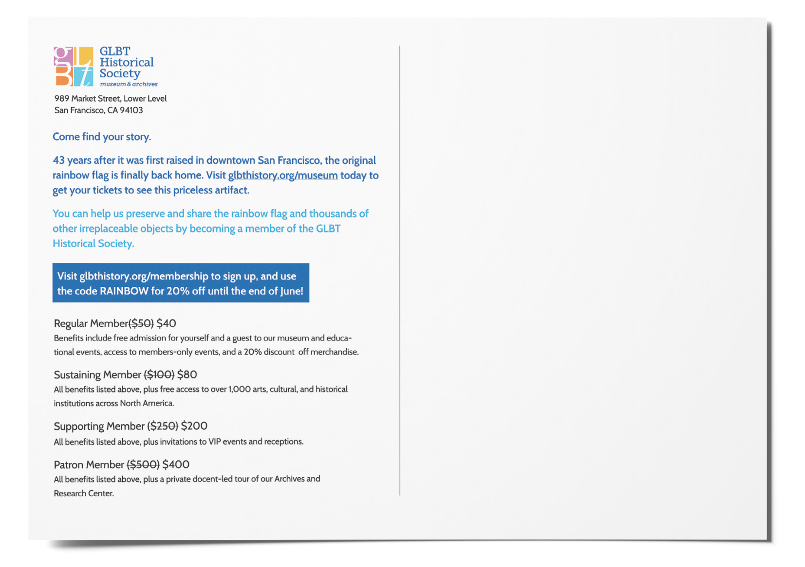
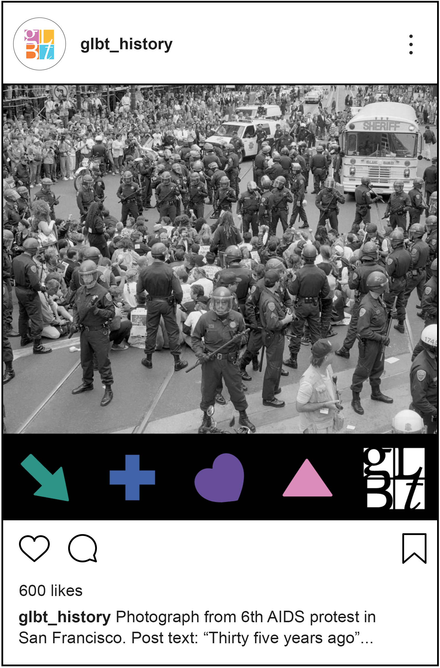
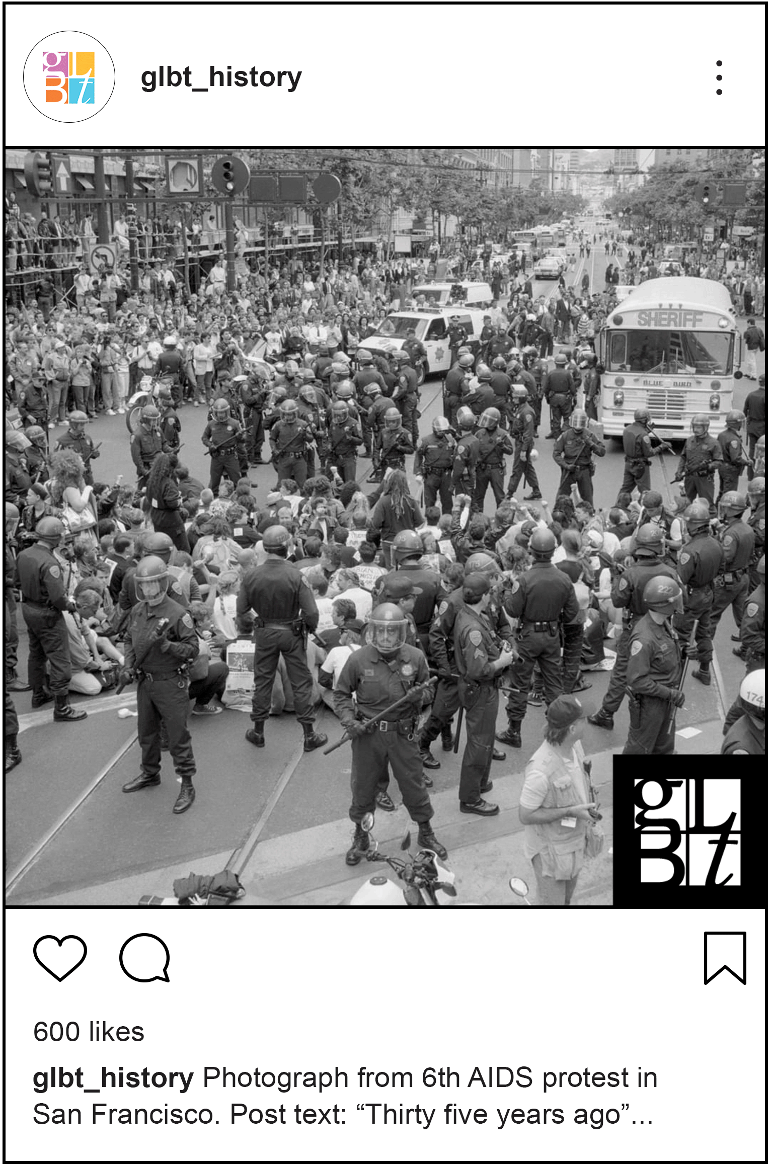
As a Designer for TBD*, I worked with a fellow designer to create a Pride campaign for the Gay Lesbian Bisexual & Trans Historical Society (GLBTHS).

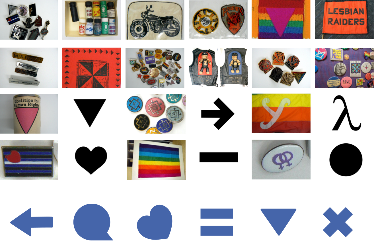
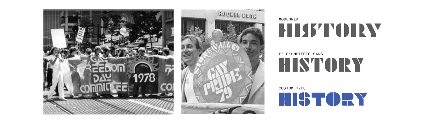
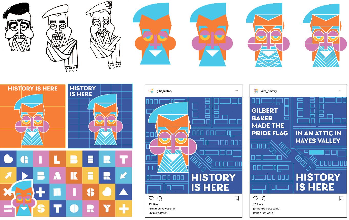
The question at the core of this project was: “How do you bring history to life?”. Our answer was to reuse artifacts of the past in a modern way. This met the GLBTHS’ goal of having a campaign that’s playful and celebrative, but still rooted in education.
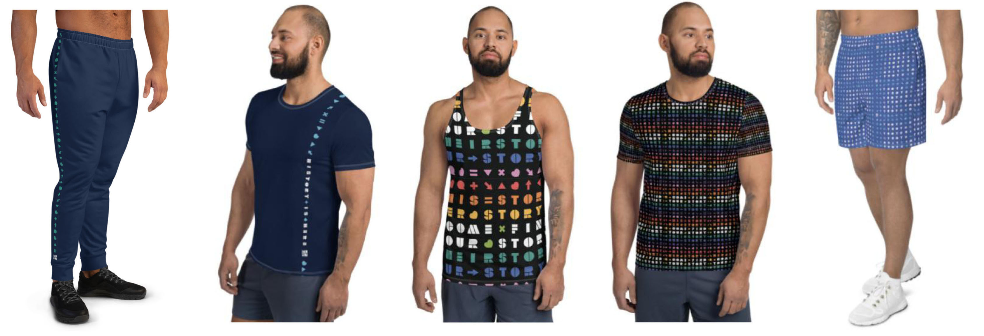
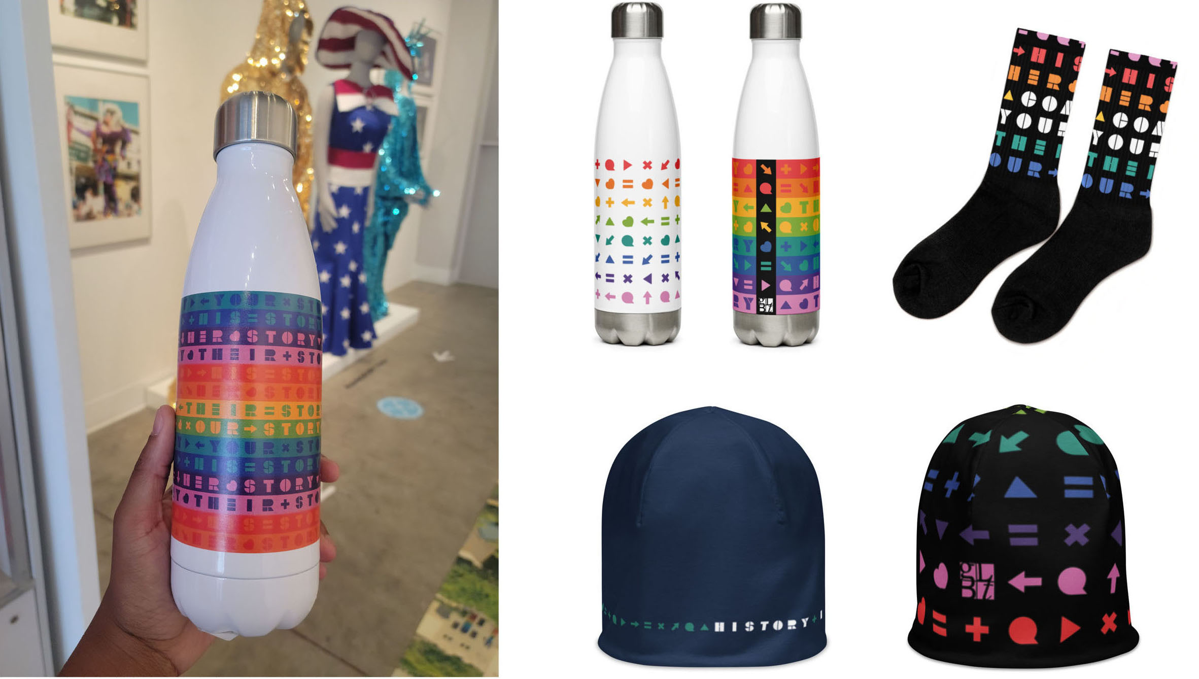
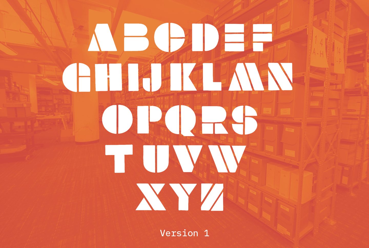
Envelope
Postcard
Post template structure: image - text - slogan
Post template variations
Merchandise (clothing)
Merchandise (accessories)
Process
The campaign's visual language comes from vintage materials found in their archive. The icons come from identity symbols used in the queer community. The color palette also comes the original gay pride flag in their collection.
The typeface used is also inspired by banners photographed at an early gay rights protest. One typeface was an unlabeled specimen, and the other was a Futura Black stencil. For the final version we merged these forms, and created "BillBoard".
The first campaign direction highlighted historical queer figures from the Bay Area, such as Gilbert Baker, the creator of the original pride flag. A geometeric illustration composed of queer symbols would be created for each figure. However, the fees and time needed to use a celebrity's likeness were not ideal.
The second direction focused more on the community as a whole, instead of individual figures. A play on the phrase "history" using pronouns, and differenly styled hands were included to emphasize the diversity of the community. In the end, a hybrid of these two ideas became the final direction.